I like it already. Nice new modern look. Thx.
Thank you for the feedback GnarZ77, I’m glad you like it. 
I agree, looks nice plutomaniac, good choice!
Can we move/reshape the ad box on the right side to top/middle, so the forum itself floats in the middle like it does in the portal? I think it would look much better/cleaner that way, if we can do that.
Yep, (nothing wrong with how it was but) the change is welcomed ![]()
I’d love to see a “Dark” theme 
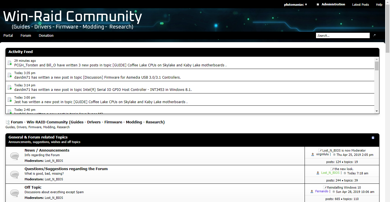
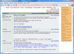
There is no option for the user to select what theme they like best so whatever I choose is global. Personally I like dark themes but some people may find it difficult to read or off-putting. That’s why I decided to keep the blue but with a darker tint and pure white fonts for good contrast. It’s the same color as the background picture traces/lines. Here are some concepts for Pure Black, Black and Dark Blue:
Came here just to say that. I use the site inverted because white backgrounds get straining on the eyes pretty fast for me.
I like the theme and colors a lot though. I just wish the white background was a dark gray background with light/white text.
EDIT: Check out https://www.overclock.net and https://forums.guru3d.com/ dark themes for an example.
I like that theme and the way to keep the mild blue on pluto 3rd picture post… I wish only that the white background could be a very light grey because i found it just too bright against the darker theme background. It’s also because most of us are browsing the site late at night.
I like the 2nd and third one, hard to decide. The white background is more what I was hoping you planned to darken, as others mentioned above 
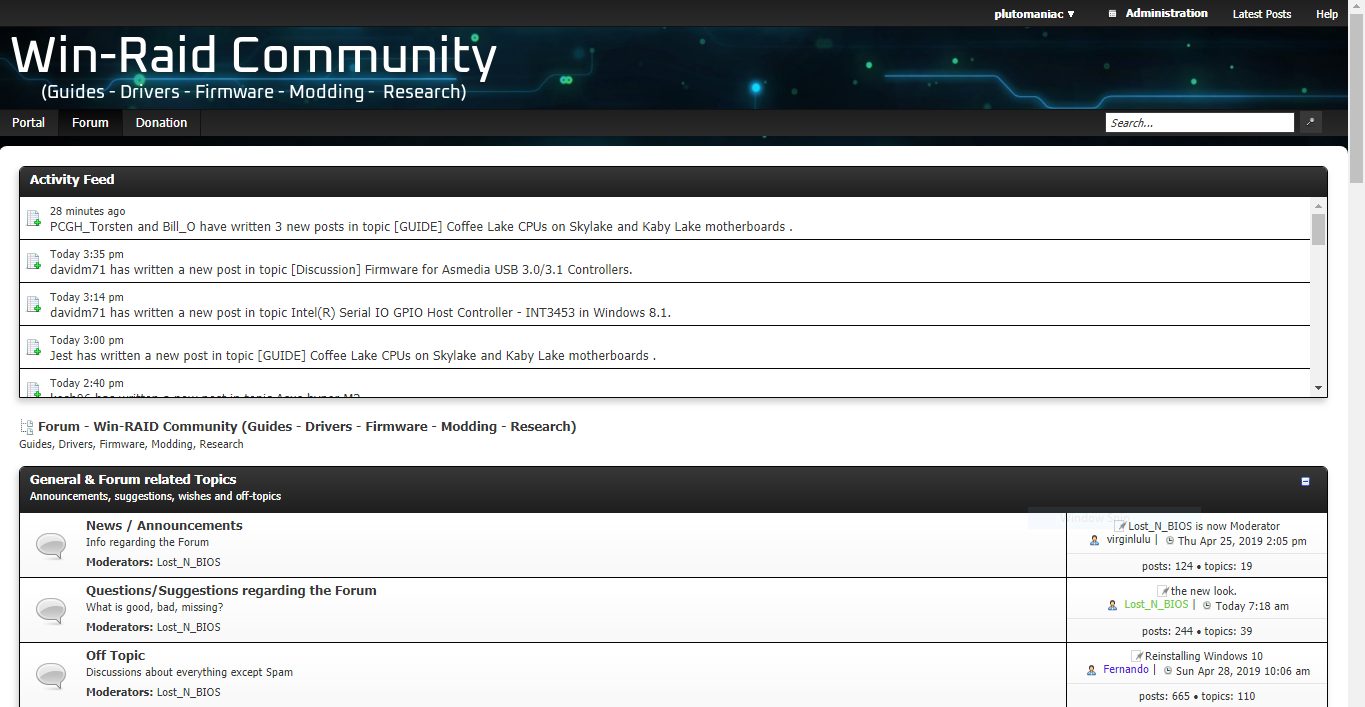
It’s already darker, just did it. It’s more grey now. Is that enough? I could leave the boxes white and make the background grey only. Maybe that’s better?
All looks white to me still, maybe we have different ideas of dark and gray  Just one opinion here though
I can tell it’s not as white now, but still looks white in general
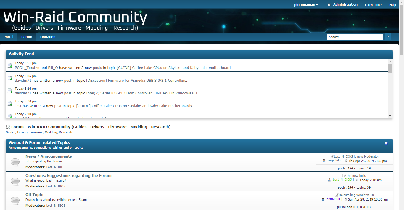
I see you padded out the left side, looks much better now, thanks!
Yes Pluto, it’s far better i can see clearly the difference. It’s like you have dim the display’s light a bit. Boxes are white OK! ![]()
If I make it too dark grey then it becomes hard to read text and at that point you might as well go with a dark theme. But I’d like to avoid that since I know some people won’t like it and we cannot change it for each user. Keeping everyone happy won’t be easy. The goal is to be tolerable and if a light grey instead of pure white background does it, then we’re golden.
Also, what do you guys think of the padding on the left & right of the forum? Do you want it “floating” like now or maximize its’ width?
Regarding the ads, do you like them on the side (like they have been for years) or on the top? Personally I prefer them on the side so that no scrolling it required to do basic things and so that we can ignore them more easily. The general consensus from other sites is that ads on the top are annoying. Some sample pictures:
Last but not least, do you prefer the text "logo" to say: "Win-Raid", "Win-Raid Community" or "Win-Raid Forum"?
On my side i do prefer "floating", when it’s "maximized" it will makes me feel like it’s more a white background again…Ads are ok on the side. Win-Raid Forum was nice too. (but that’s only my view of this forum… you might want to wait for more feedbacks)
New look is fine. If I don’t want to see adds I just hit the ZOOM function to 150% and then I don’t need my glasses to read either! BONUS
If you want something really cutting and ‘edgy’ we could call the forum “Win-Raiders” with appropriate black flag

Sailing to where bios modding has not gone before!
When your BIOS mod has unexpected and treasured results!
Cheers and much success!
Yes now that I see the main area floating with the background image, I dig it so I’ll keep the padding. As for the colors, I think I’m set for now. We’ll see if more people request something specific.
I’m curious to know what other people think about the title options: "Win-Raid", "Win-Raid Community" and "Win-Raid Forum".
Oh no… ![]()
“Not sure” is my vote on the title, I can’t even remember what it was before?
Can the background image be fixed, or does it not work good in all resolutions with it tiled- I tested it as fixed on my end and it looked great >> background-attachment: Fixed
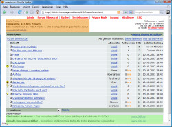
It was "Fernando’s Win-RAID Forum"
Done
I would keep it at Win-Raid Forum, so to keep it recognizable as it always was. But that’s just me, spartan, and current changes are already great.
Alright, good. I found the source for the background image (credit at the Imprint/FAQ) so it’s much (much) better quality now at half the file size. I’ve also adjusted the logo to be simpler and its color to be light grey, same as the rest of the forum.